Monday, December 4, 2017
Music or Misconception?
Have you ever experienced a break up, a family split, a dying loved one, or just a bad day? Follow up question, have you listened to sad, melancholy music to make you feel better? If you have, trust me, you're not the only one. You listen to the blues, Secondhand Serenade, and maybe even Johnny Cash. You sang every word and sat there thinking about how the singer feels just as bad as you. You cry a bit, too. After you're done, you feel a small weight has lifted off your shoulders, and you can breathe a bit easier. Why does this happen? In the last post, I explained how the amygdala in the gray matter of your brain controls emotion expression and emotional memories. Even so, in this article in the Huffington Post, they disregard this scientific assumption for another one. A study with a sample of 220 participants all got asked the same request: think about a particularly sad event in your life, and what sad music did you listen to and why. Dr. Annemieke van den Tol told the Post, "We found in our research that people's music choice is linked to the individual's own expectations for listening to music and its effects on them" (Patel, 2014). This is explained as though people who listen to sad music first think about their situation as the begin the music. Thus, the effects are subconsciously self-induced, with your brain being the culprit behind the curtain. They also found that this experience "had a negative impact on creating a better mood" (Patel, 2014). Thus, this had no real benefit whatsoever to the listener. This does not mean that the music doesn't play a part; the "value", one would call it, of the music depended on the listener, and made it to feel like it truly did something. However, this is just one study, and many people believe otherwise. But what do you believe?
Sources: Patel, A. (2014, February 24). Music And Health: Do Sad Songs Actually Make Us Happier? Retrieved December 04, 2017, from http://www.huffingtonpost.ca/2014/02/24/music-and-health_n_4847373.html
Music and The Brain
Ever wonder why music affects us so much? Or how? Well, here are some answers in short. The brain can do so many things-- we don't always understand it all either. What we do know is there are different parts of the brain that control and do different things. For example, the prefrontal cortex is involved in behavior and decision-making; the amygdala controls certain emotions, that including fear. However, the amygdala is one of the big components of feeling sadness, joy, anger, or angst with music. The amygdala also plays a part in emotional memory; this memory is a type triggered by positive or negative feelings, and this contributed to the feelings from listening to music. So, this is a reason why so many people believe that listening to music while studying helps the student do so much better on tests, homework, etc.
Here is an interesting read to anyone who would like to learn more in-depth information on the brain's interpretations of music. http://serendip.brynmawr.edu/bb/neuro/neuro99/web1/Sancar.html
Sources:
https://rampages.us/jethrosmitty/wp-content/uploads/sites/12942/2015/11/Brain-on-music.jpg
http://scholarpedia.org/article/Amygdala
Thursday, November 9, 2017
Vector Graphics Tuned In Logo
Here above are logos specifically for this blog, Tuned In, made by me using a program called Method Draw. It is a bit more of a simple program, compared to other ones I have seen, but it worked well for this assignment. My first image is of a heart and headphones; the whole meaning to my blog is to offer information on what effect music can have on people, physically and mentally. Thus, the heart represents how music can emotionally effect us, and the music is represented through the headphones.
As for the other logo, it is a little more verbal, and a little more to decipher. Between two mirrored Alto clef symbols (one of the clefs used to symbolize for notes and key) is the initials of my blog title, Tuned In. Again, this is to be more direct with the logo, but the initials along with the intricate design of the clef, it seems more elegant and more attractive. I like this one better than the other, but the emotional meaning of what my blog represents is not truly displayed in this logo.
Wednesday, November 1, 2017
Textorizer Photos
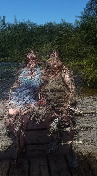
The three top photos are my original pictures taken, and the three lower photos are edited through the program Textorizer. The first photo is of me and my mother when we had gone up north for the weekend to go exploring local attractions, and it was an amazing time. This photo I altered in Textorizer 1, using many words overlapping each other but still conveying a message. I found this to be the most difficult out of the three edits, because I had to get it just right to read some of the words, but see what the image is. The faces are a little hard to see, but the art of it is not to be completely perfect like the original. The second image is the star of my photo inspiration-- my dog Zeus. This photo is an already black and white representation of him sitting and looking over the lake, where we live. The edited image is the Excoffizer version of this, and it is a good chose, because it does make the viewer feel as if their eyes are "vibrating" while looking at it, especially up close. Lastly, my third photo is also of Zeus, but a up-close portrait type. I chose to edit this in Textorizer 2, overlapping the photo with words and sayings describing the photo. In this case, I chose to use a saying to describe the great things about dogs and their love and loyalty. Overall, I really liked using this program, but it was still difficult for me to find the best image to use to be seen and understood by the viewer. I hope you enjoy!
Tagxedo Photo
This is a photo of me transformed in the Tagxedo application, which use words as the figure or shape you choose. I always liked the portraits used with their words describing them or what they are representing. So, I decided I wanted to choose words that I would like to describe myself or something that I would like to be. However, I found this program to be quite frustrating to use when choosing a picture as well as editing it enough to be fully recognizable when the words just fill the shape. Also, I wish there had been more options to use to possibly make it more personalized for every picture. Never the less, I am quite proud of this image, for I think it was executed successfully. I hope you enjoy!
Tuesday, October 31, 2017
ASCII Photos
The above pictures are edited photos of the originals, also posted. In attempting to create an ASCII, or American Standard Code for Information Interchange, I used two different programs. The first picture depicted is of myself, using TEXT-IMAGE.com, one that is more in-depth in features. The second image is of a praying mantis I found hanging around my house. I used the application GlassGiant.com to transform it into an ASCII image, and this one had less features to change on it. I liked using TEXT-IMAGE.com much better, because I feel I had more control over what I was creating, and I could pick and choose which options I find better use for the image. GlassGiant.com was not bad, but the most I could change in it was the maximum width and white on black or black on white text. I also like the other images I made on TEXT-IMAGE, changing the original photos into HTML and Matrix forms, which was another plus for me. I like the idea of using a typewriter to make art, and having these programs can really inspire others with the creativity and limitless ideas!
Thursday, October 26, 2017
Flame Drawing Images
For this art program, Flame, I wanted to use the combination of colors instead of drawing actual pictures to represent emotions. Instead, I looked into colors and their represented feelings and emotions to create images that may relate to how someone is feeling. In some studies, people who struggle with mental illnesses or emotional distresses. In my one image, I wanted to illustrate depression, and the many forms it can take. I used dark blue in the background to show the depressive aspects that may not always be present, but still lingers underneath other emotions currently being expressed. Then I drew wispy colors of happier colors, such as yellow, pink, and green, to display the varying, fast changing emotions that may be a "high" to the individuals, but still have that constant "low". As for the other image, it is a little less deep, and portrays happiness, and elation. This is more hectic, with a bright green in the background for vibrancy in attitudes, with splashes of yellow, light blue, and pinks. These colors together can suggest energy, faith, love, and fertility or freshness, etc. I think that if some people like to express their feelings through colors, then even this can be helpful to them, and it's also an entertaining program!
Subscribe to:
Posts (Atom)
Digital Media Course Final Reflection
This music-inspired blog is also the blog used for my Digital Media class, and as such, I will be dedicating a post reflecting my growth an...
-
The three top photos are my original pictures taken, and the three lower photos are edited through the program Textorizer. The first photo ...
-
For this art program, Flame, I wanted to use the combination of colors instead of drawing actual pictures to represent emotions. Instead, I...
-
Do you have your own separate playlist for when you go to the gym or your morning run? Do you listen to something hard-core or lightly fast...